Choosing a font face
📆 Created on July 3, 2021.So this week I started working on the dialogue system for Electric Noir. Now, this is something I've spent a lot of time on before the pivot so there isn't a lot of code to write, I am pretty confident everyhing I had before can be moved over without many changes.
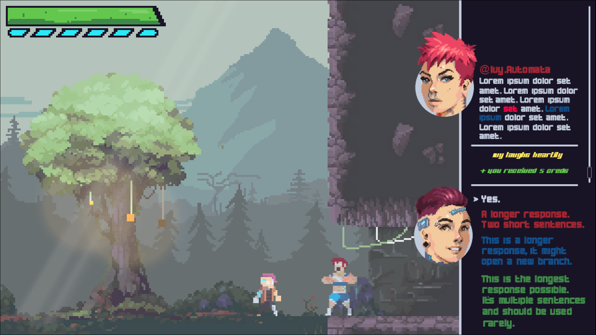
I am mocking up a new UI for the dialogue system though. I posted the first image below to some close friends and got some pretty great feedback.
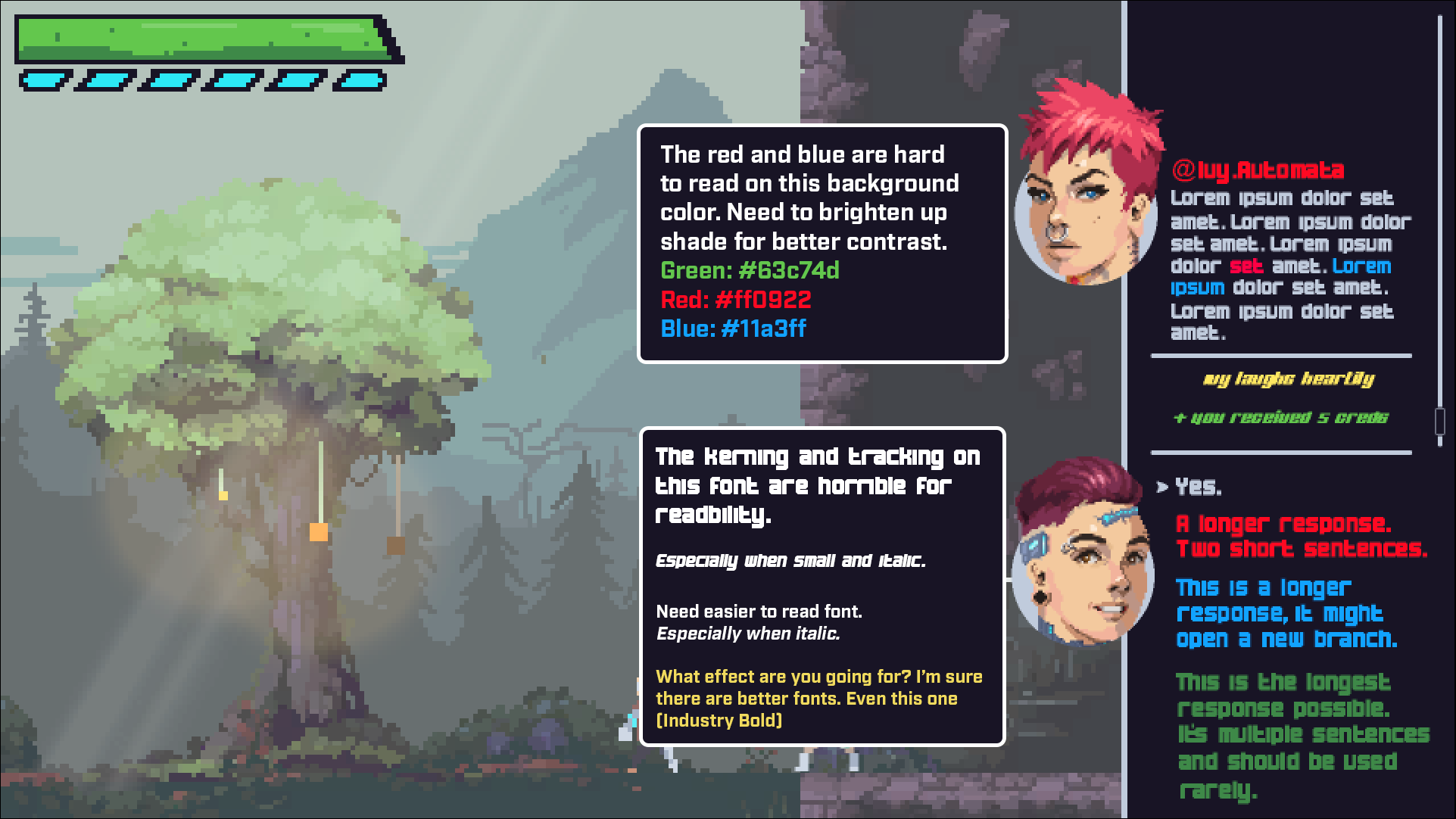
My friends pointed out that the text colors made it hard to read the text, especially the red and green. They also pointed out that the font I was using there made the UI almost unreadable - I honestly never even noticed this. One friend even posted their own version with their notes added to the image, which was incredible.
I took what they wrote to heart and sat down to examine the font style I was using. I hadn't put too much thought into it to be honest - which is exactly why I got called out on it lol - so I decided to take a bunch of fonts that I liked, put them up against each other, pick a winner and go with that.
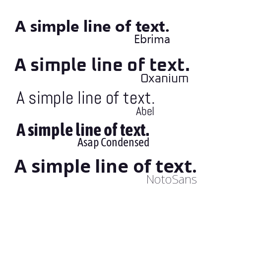
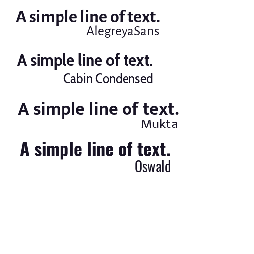
So out of this list I really liked "Ebrima" the most, but that's a closed-source font (oops) so I went with Cabin Condensed instead. It takes up a similar amount of space horizontally, it is less "rough" and "angled" at the edges, which I think makes it much easier on the eyes.
I added some input prompts and tried to make it clearer that the big green bar at the top is the health bar. Also, the main character will now emote in reaction to the selected response!
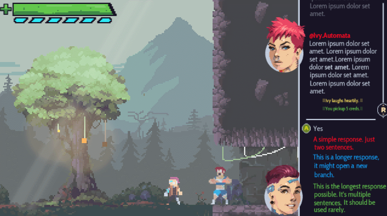
I'm really happy with the mockup so far so the next step is plan out how to build the UI in the game so I can prepare the assets I'll need. What do you think about the UI? Shoot me your thoughts on twitter.